KEY TAKEAWAYS
Valuable lessons I learned.
Understanding User Needs is a Continuous Process
Initially, I assumed that addressing the user pain points identified in research would be straightforward. However, the process required constant iteration and re-evaluation. Designing for simplicity while balancing functionality meant frequently revisiting and refining solutions.
Collaboration Drives Better Outcomes
Throughout the project, I maintained regular communication with stakeholders and developers. Their feedback at each stage helped uncover overlooked challenges and ensured the design aligned with both user and business goals. Collaboration was essential for delivering a polished final product.
Asking the Right Questions Shapes the Process
Early on, my focus was primarily on user needs. While valuable, I later realized that incorporating business constraints and technical feasibility into research questions would have streamlined iterations. Tailoring questions to cover all aspects ensured a more holistic approach to problem-solving.
NEXT STEPS
What next?
The redesigned Platforms Page will undergo usability testing to gather feedback and fine-tune the experience further. Key performance metrics like user engagement, search efficiency, and platform discovery rates will be monitored to measure success.
GOALS
Helping Users Navigate Multi-Chain DeFi Protocols Effortlessly.
Our aim was to create a user-friendly and comprehensive platform discovery experience for both seasoned DeFi participants and newcomers. The existing Platforms Page lacked the accessibility and functionality required to achieve this goal effectively. After defining the problem, we established the following objectives:
🎯 Enhance Accessibility: Design intuitive filters (e.g., network, TVL, platform name) to make it easier for users to find protocols across chains like Solana, SUI, and Aptos.
🎯 Streamline Information Presentation: Display key data points—such as name, logo, description, TVL, and social links—in a concise yet engaging manner for quick comprehension.
🎯 Ensure Consistency and Simplicity: Align the design with SonarWatch’s existing framework while maintaining visual clarity and reducing cognitive load.
RESEARCH
Understanding User Needs to Redefine Platform Discovery.
To design a more effective and accessible Platforms Page for SonarWatch, we conducted extensive user research and analyzed the current platform’s pain points. Our research focused on understanding the behaviors, expectations, and frustrations of different user groups, such as experienced DeFi participants, yield farmers, blockchain ecosystem enthusiasts, and casual investors.
Research Methods,
User Interviews: Conducted interviews with experienced DeFi participants and newcomers to understand their discovery habits and preferences.
Competitor Analysis: Studied how similar DeFi dashboards present protocols and allow for exploration.
Heuristic Evaluation: Analyzed the existing Platforms Page for usability issues, accessibility gaps, and design inconsistencies.
Key Findings.
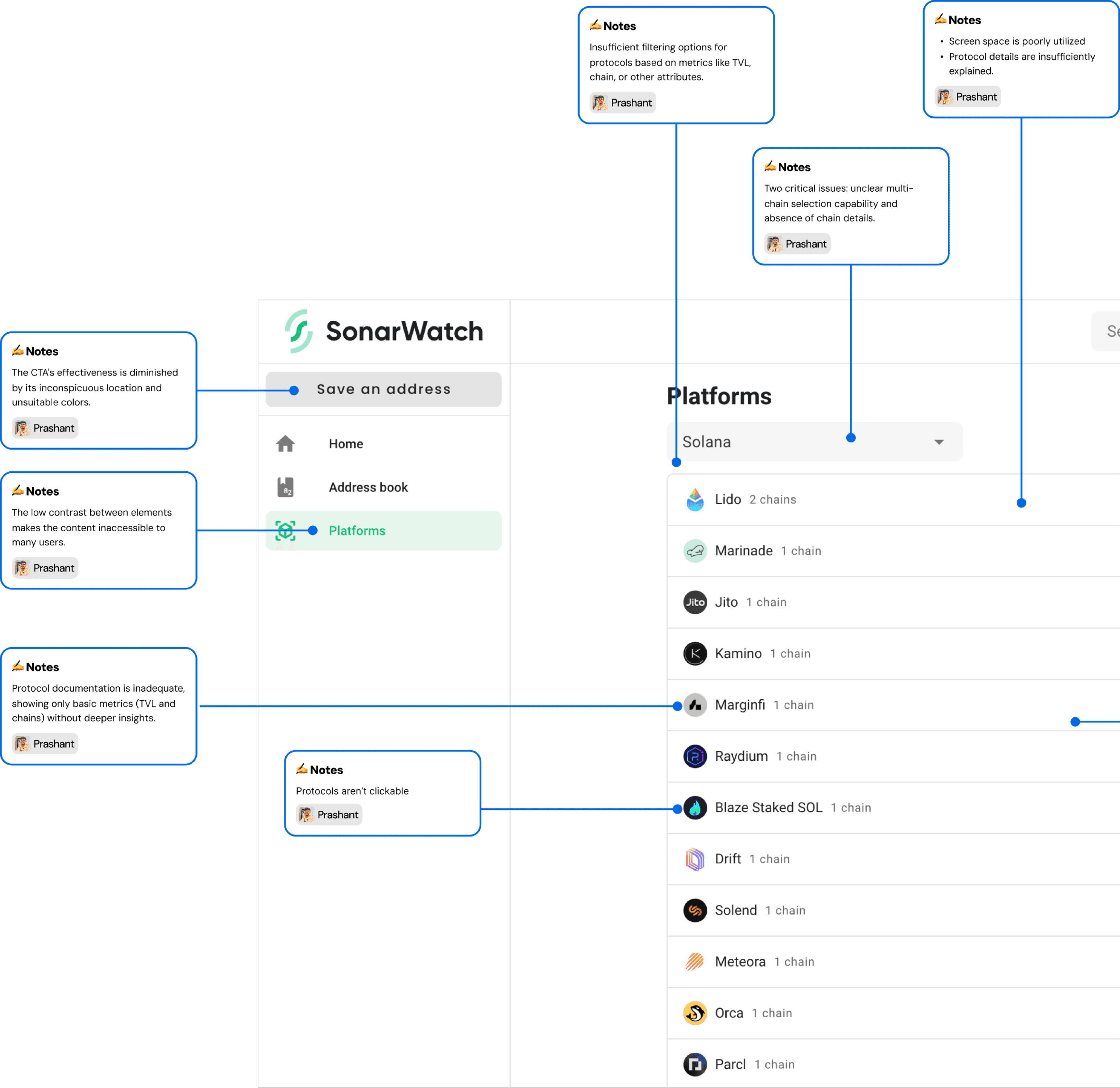
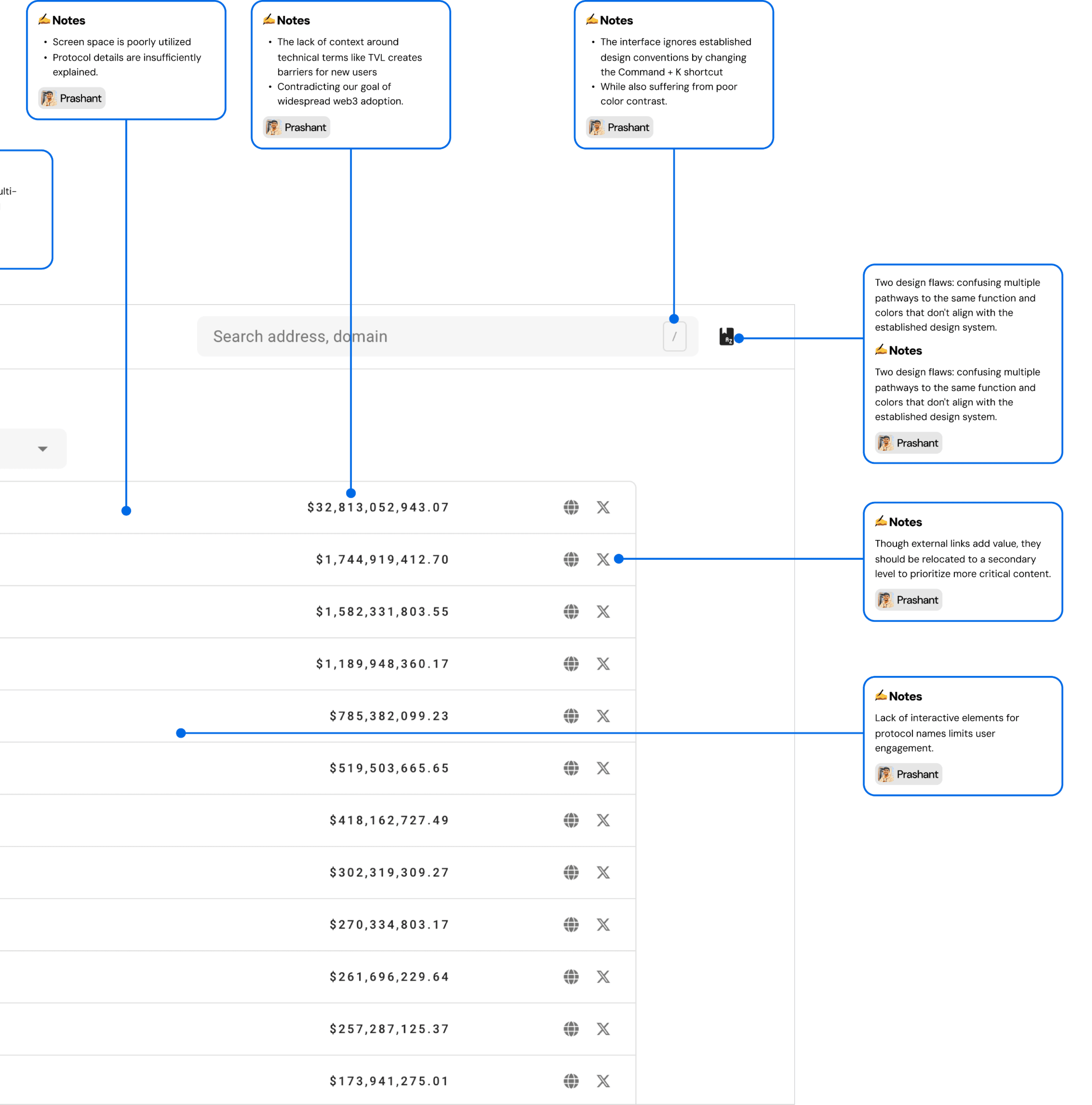
Ineffective Filtering: Users struggled to find platforms due to the lack of advanced filters like network, TVL, or protocol type.
Cluttered Content: Overwhelming data presentation made it hard to quickly grasp platform details.
Accessibility Issues: Poor color contrast and inconsistent design hindered usability and trust.
Feature Discoverability: Icons and buttons lacked clear labels, confusing users about their purpose.
These insights led me to prioritize efficiency and ease of use in the redesign.
IDEATION
Designing for Simplicity and Discovery.
Approach to Ideation,
User-Centric Design: Prioritized features that address specific pain points, such as intuitive filtering options, concise data presentation, and seamless navigation.
Streamlined Content: Focused on presenting critical information (name, TVL, networks, logo, social links) in a digestible format, avoiding overwhelming users with too much data at once.
Accessible & Inclusive Design: Integrated high-contrast color schemes and maintained consistency with SonarWatch’s design framework for a cohesive user experience.
Interaction-Driven Features: Brainstormed tooltips, hover effects, and visually distinct interactive elements to improve feature discoverability.
WIREFRAMES
Laying the Foundation for a User-Friendly Design.
I began with low-fidelity wireframes to outline the structure and flow of the Platforms Page. The focus was on positioning filters effectively, simplifying the layout for displaying critical details like TVL and networks, and ensuring alignment with SonarWatch’s design framework.
Through iterative feedback and refinement, the wireframes provided a clear blueprint for creating an intuitive, functional, and visually cohesive user experience.
*Just so I don't taint your eyes, I won't be inserting the tens of illegible, low-fidelity screens, but I'm sure you'll love the final designs :)
FINAL DESIGNS
Transforming Platform Discovery with Simplicity and Efficiency.
The final designs for the SonarWatch Platforms Page address all the identified problems, ensuring a user-friendly and cohesive experience. Key enhancements include:
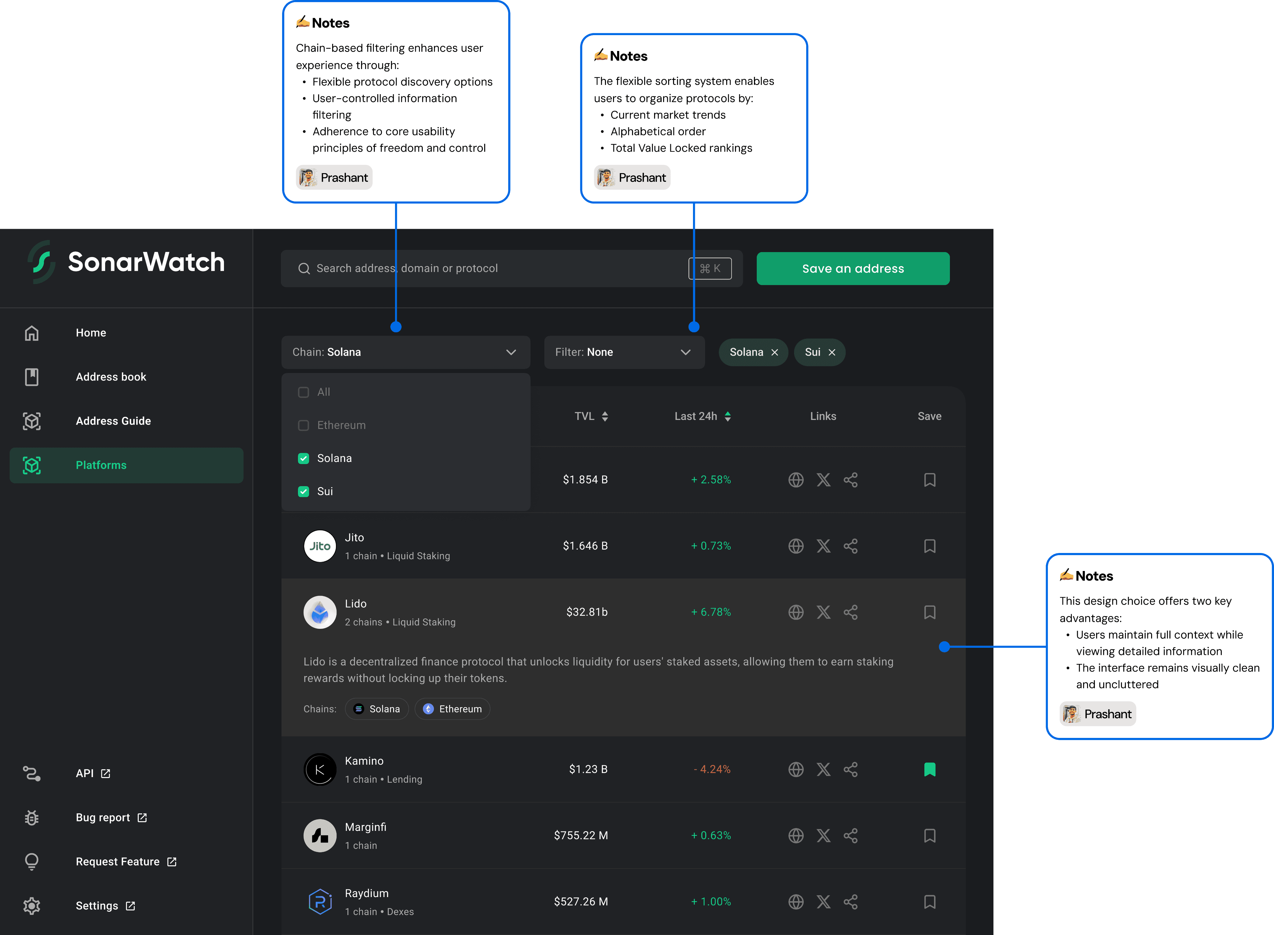
1. Advanced Filters for Seamless Navigation
Chain-based filtering allows users to focus on protocols from specific networks, such as Solana or SUI.
Flexible sorting options enable users to organize platforms by TVL, alphabetical order, or market trends, streamlining discovery.
2. Clean and Informative Layout
Each platform is displayed in a card format with concise, essential details: logo, short description, TVL, and supported chains.
Hover states and tooltips provide additional context without cluttering the interface.
3. Unified Search and Action Features
A single search bar simplifies the process of finding protocols by name, domain, or address.
The “Save an Address” button has been prominently positioned for easy access, enhancing user convenience.
4. Enhanced Usability and Consistency
The sidebar is updated to present a more organized structure, aligning with SonarWatch’s overall design framework.
Clear bookmarking options reduce friction for frequent users, making protocol revisits more efficient.
5. Accessibility and Aesthetic Refinements
Improved contrast ratios ensure readability for all users.
Both dark and light themes have been optimized to cater to different user preferences.
These designs embody SonarWatch’s mission of making DeFi exploration accessible, visually appealing, and highly functional. Let me know if you'd like to refine or add anything else!
Transforming Complexity into Clarity: Increasing User Engagement on SonarWatch's Platform by 45%.
MY ROLES:
Researcher, UX & UI designer, Visual designer
TIMELINE:
June - September, 2023
SCOPE:
Web Platform Redesign
CONTEXT
TL;DR
In September 2024, I undertook a project to redesign the Ecosystem/Platforms page for SonarWatch, a DeFi dashboard focused on Solana, SUI, and Aptos networks. The existing page was not user-friendly and made discovering new platforms challenging.
My goal was to enhance accessibility by introducing intuitive filters and a simplified layout. This allowed users to easily find platforms based on network or name and quickly view essential information like websites, social media links, and Total Value Locked (TVL).
This redesign was part of a bounty from SonarWatch seeking innovative ideas to improve their platform discovery feature. My roles included UX research, UI design, and visual design, all while ensuring consistency with SonarWatch's existing branding.
PROBLEM
Essential platform information is buried, hindering user exploration.
The existing SonarWatch platform page lacked user-friendly features for effective DeFi platform discovery. Users faced challenges in finding relevant platforms due to insufficient filtering options, overwhelming information, and limited accessibility to key metrics.
Lack of Filters and Overwhelming Information
Users struggled to filter platforms by network or protocol type, leading to inefficient exploration. Over 65% of experienced users found it difficult to locate specific protocols, while 45% of newcomers felt overwhelmed by the information layout.
Limited Access to Key Metrics
Essential metrics like TVL, referral links, and social profiles were not easily accessible, causing 55% of users to feel uninformed about platforms.
Cross-Chain Navigation Issues
Users had difficulty exploring protocols across supported blockchains (Solana, SUI, Aptos), with over 60% finding the navigation frustrating.

prashantux.eth
Portfolio
@prashantdp7
on all social media
Resume
+91 9019289930
I'm available
Let's Connect
Feel free to contact me if having any questions. I'm available for new projects or just for chatting.
KEY TAKEAWAYS
Valuable lessons I learned.
Understanding User Needs is a Continuous Process
Initially, I assumed that addressing the user pain points identified in research would be straightforward. However, the process required constant iteration and re-evaluation. Designing for simplicity while balancing functionality meant frequently revisiting and refining solutions.
Collaboration Drives Better Outcomes
Throughout the project, I maintained regular communication with stakeholders and developers. Their feedback at each stage helped uncover overlooked challenges and ensured the design aligned with both user and business goals. Collaboration was essential for delivering a polished final product.
Asking the Right Questions Shapes the Process
Early on, my focus was primarily on user needs. While valuable, I later realized that incorporating business constraints and technical feasibility into research questions would have streamlined iterations. Tailoring questions to cover all aspects ensured a more holistic approach to problem-solving.
NEXT STEPS
What next?
The redesigned Platforms Page will undergo usability testing to gather feedback and fine-tune the experience further. Key performance metrics like user engagement, search efficiency, and platform discovery rates will be monitored to measure success.
GOALS
Helping Users Navigate Multi-Chain DeFi Protocols Effortlessly.
Our aim was to create a user-friendly and comprehensive platform discovery experience for both seasoned DeFi participants and newcomers. The existing Platforms Page lacked the accessibility and functionality required to achieve this goal effectively. After defining the problem, we established the following objectives:
🎯 Enhance Accessibility: Design intuitive filters (e.g., network, TVL, platform name) to make it easier for users to find protocols across chains like Solana, SUI, and Aptos.
🎯 Streamline Information Presentation: Display key data points—such as name, logo, description, TVL, and social links—in a concise yet engaging manner for quick comprehension.
🎯 Ensure Consistency and Simplicity: Align the design with SonarWatch’s existing framework while maintaining visual clarity and reducing cognitive load.
RESEARCH
Understanding User Needs to Redefine Platform Discovery.
To design a more effective and accessible Platforms Page for SonarWatch, we conducted extensive user research and analyzed the current platform’s pain points. Our research focused on understanding the behaviors, expectations, and frustrations of different user groups, such as experienced DeFi participants, yield farmers, blockchain ecosystem enthusiasts, and casual investors.
Research Methods,
User Interviews: Conducted interviews with experienced DeFi participants and newcomers to understand their discovery habits and preferences.
Competitor Analysis: Studied how similar DeFi dashboards present protocols and allow for exploration.
Heuristic Evaluation: Analyzed the existing Platforms Page for usability issues, accessibility gaps, and design inconsistencies.
Key Findings.
Ineffective Filtering: Users struggled to find platforms due to the lack of advanced filters like network, TVL, or protocol type.
Cluttered Content: Overwhelming data presentation made it hard to quickly grasp platform details.
Accessibility Issues: Poor color contrast and inconsistent design hindered usability and trust.
Feature Discoverability: Icons and buttons lacked clear labels, confusing users about their purpose.
These insights led me to prioritize efficiency and ease of use in the redesign.
IDEATION
Designing for Simplicity and Discovery.
Approach to Ideation,
User-Centric Design: Prioritized features that address specific pain points, such as intuitive filtering options, concise data presentation, and seamless navigation.
Streamlined Content: Focused on presenting critical information (name, TVL, networks, logo, social links) in a digestible format, avoiding overwhelming users with too much data at once.
Accessible & Inclusive Design: Integrated high-contrast color schemes and maintained consistency with SonarWatch’s design framework for a cohesive user experience.
Interaction-Driven Features: Brainstormed tooltips, hover effects, and visually distinct interactive elements to improve feature discoverability.
WIREFRAMES
Laying the Foundation for a User-Friendly Design.
I began with low-fidelity wireframes to outline the structure and flow of the Platforms Page. The focus was on positioning filters effectively, simplifying the layout for displaying critical details like TVL and networks, and ensuring alignment with SonarWatch’s design framework.
Through iterative feedback and refinement, the wireframes provided a clear blueprint for creating an intuitive, functional, and visually cohesive user experience.
*Just so I don't taint your eyes, I won't be inserting the tens of illegible, low-fidelity screens, but I'm sure you'll love the final designs :)
FINAL DESIGNS
Transforming Platform Discovery with Simplicity and Efficiency.
The final designs for the SonarWatch Platforms Page address all the identified problems, ensuring a user-friendly and cohesive experience. Key enhancements include:
1. Advanced Filters for Seamless Navigation
Chain-based filtering allows users to focus on protocols from specific networks, such as Solana or SUI.
Flexible sorting options enable users to organize platforms by TVL, alphabetical order, or market trends, streamlining discovery.
2. Clean and Informative Layout
Each platform is displayed in a card format with concise, essential details: logo, short description, TVL, and supported chains.
Hover states and tooltips provide additional context without cluttering the interface.
3. Unified Search and Action Features
A single search bar simplifies the process of finding protocols by name, domain, or address.
The “Save an Address” button has been prominently positioned for easy access, enhancing user convenience.
4. Enhanced Usability and Consistency
The sidebar is updated to present a more organized structure, aligning with SonarWatch’s overall design framework.
Clear bookmarking options reduce friction for frequent users, making protocol revisits more efficient.
5. Accessibility and Aesthetic Refinements
Improved contrast ratios ensure readability for all users.
Both dark and light themes have been optimized to cater to different user preferences.
These designs embody SonarWatch’s mission of making DeFi exploration accessible, visually appealing, and highly functional. Let me know if you'd like to refine or add anything else!
CONTEXT
CONTEXT
TL;DR
TL;DR
In September 2024, I undertook a project to redesign the Ecosystem/Platforms page for SonarWatch, a DeFi dashboard focused on Solana, SUI, and Aptos networks. The existing page was not user-friendly and made discovering new platforms challenging.
My goal was to enhance accessibility by introducing intuitive filters and a simplified layout. This allowed users to easily find platforms based on network or name and quickly view essential information like websites, social media links, and Total Value Locked (TVL).
This redesign was part of a bounty from SonarWatch seeking innovative ideas to improve their platform discovery feature. My roles included UX research, UI design, and visual design, all while ensuring consistency with SonarWatch's existing branding.
PROBLEM
Essential platform information is buried, hindering user exploration.
The existing SonarWatch platform page lacked user-friendly features for effective DeFi platform discovery. Users faced challenges in finding relevant platforms due to insufficient filtering options, overwhelming information, and limited accessibility to key metrics.
Lack of Filters and Overwhelming Information
Users struggled to filter platforms by network or protocol type, leading to inefficient exploration. Over 65% of experienced users found it difficult to locate specific protocols, while 45% of newcomers felt overwhelmed by the information layout.
Limited Access to Key Metrics
Essential metrics like TVL, referral links, and social profiles were not easily accessible, causing 55% of users to feel uninformed about platforms.
Cross-Chain Navigation Issues
Users had difficulty exploring protocols across supported blockchains (Solana, SUI, Aptos), with over 60% finding the navigation frustrating.
I'm available
Let's Connect
Feel free to contact me if having any questions. I'm available for new projects or just for chatting.
Transforming Complexity into Clarity: Increasing User Engagement on SonarWatch's Platform by 45%.
MY ROLES:
Researcher, UX & UI designer, Visual designer
TIMELINE:
June - September, 2023
SCOPE:
Web Platform Redesign
Resume
prashantux.eth
@prashantdp7
on all social media`
+91 9019289930
Transforming Complexity into Clarity: Increasing User Engagement on SonarWatch's Platform by 45%.
MY ROLES:
Researcher, UX & UI designer, Visual designer
TIMELINE:
June - September, 2023
SCOPE:
Web Platform Redesign
In September 2024, I undertook a project to redesign the Ecosystem/Platforms page for SonarWatch, a DeFi dashboard focused on Solana, SUI, and Aptos networks. The existing page was not user-friendly and made discovering new platforms challenging.
My goal was to enhance accessibility by introducing intuitive filters and a simplified layout. This allowed users to easily find platforms based on network or name and quickly view essential information like websites, social media links, and Total Value Locked (TVL).
This redesign was part of a bounty from SonarWatch seeking innovative ideas to improve their platform discovery feature. My roles included UX research, UI design, and visual design, all while ensuring consistency with SonarWatch's existing branding.
CONTEXT
TL;DR
PROBLEM
Essential platform information is buried, hindering user exploration.
The existing SonarWatch platform page lacked user-friendly features for effective DeFi platform discovery. Users faced challenges in finding relevant platforms due to insufficient filtering options, overwhelming information, and limited accessibility to key metrics.
Lack of Filters and Overwhelming Information
Users struggled to filter platforms by network or protocol type, leading to inefficient exploration. Over 65% of experienced users found it difficult to locate specific protocols, while 45% of newcomers felt overwhelmed by the information layout.
Limited Access to Key Metrics
Essential metrics like TVL, referral links, and social profiles were not easily accessible, causing 55% of users to feel uninformed about platforms.
Cross-Chain Navigation Issues
Users had difficulty exploring protocols across supported blockchains (Solana, SUI, Aptos), with over 60% finding the navigation frustrating.
GOALS
Helping Users Navigate Multi-Chain DeFi Protocols Effortlessly.
Our aim was to create a user-friendly and comprehensive platform discovery experience for both seasoned DeFi participants and newcomers. The existing Platforms Page lacked the accessibility and functionality required to achieve this goal effectively. After defining the problem, we established the following objectives:
🎯 Enhance Accessibility: Design intuitive filters (e.g., network, TVL, platform name) to make it easier for users to find protocols across chains like Solana, SUI, and Aptos.
🎯 Streamline Information Presentation: Display key data points—such as name, logo, description, TVL, and social links—in a concise yet engaging manner for quick comprehension.
🎯 Ensure Consistency and Simplicity: Align the design with SonarWatch’s existing framework while maintaining visual clarity and reducing cognitive load.
RESEARCH
Understanding User Needs to Redefine Platform Discovery.
To design a more effective and accessible Platforms Page for SonarWatch, we conducted extensive user research and analyzed the current platform’s pain points. Our research focused on understanding the behaviors, expectations, and frustrations of different user groups, such as experienced DeFi participants, yield farmers, blockchain ecosystem enthusiasts, and casual investors.
Research Methods,
User Interviews: Conducted interviews with experienced DeFi participants and newcomers to understand their discovery habits and preferences.
Competitor Analysis: Studied how similar DeFi dashboards present protocols and allow for exploration.
Heuristic Evaluation: Analyzed the existing Platforms Page for usability issues, accessibility gaps, and design inconsistencies.
Key Findings.
Ineffective Filtering: Users struggled to find platforms due to the lack of advanced filters like network, TVL, or protocol type.
Cluttered Content: Overwhelming data presentation made it hard to quickly grasp platform details.
Accessibility Issues: Poor color contrast and inconsistent design hindered usability and trust.
Feature Discoverability: Icons and buttons lacked clear labels, confusing users about their purpose.
These insights led me to prioritize efficiency and ease of use in the redesign.
IDEATION
Designing for Simplicity and Discovery.
Approach to Ideation,
User-Centric Design: Prioritized features that address specific pain points, such as intuitive filtering options, concise data presentation, and seamless navigation.
Streamlined Content: Focused on presenting critical information (name, TVL, networks, logo, social links) in a digestible format, avoiding overwhelming users with too much data at once.
Accessible & Inclusive Design: Integrated high-contrast color schemes and maintained consistency with SonarWatch’s design framework for a cohesive user experience.
Interaction-Driven Features: Brainstormed tooltips, hover effects, and visually distinct interactive elements to improve feature discoverability.
WIREFRAMES
Laying the Foundation for a User-Friendly Design.
I began with low-fidelity wireframes to outline the structure and flow of the Platforms Page. The focus was on positioning filters effectively, simplifying the layout for displaying critical details like TVL and networks, and ensuring alignment with SonarWatch’s design framework.
Through iterative feedback and refinement, the wireframes provided a clear blueprint for creating an intuitive, functional, and visually cohesive user experience.
*Just so I don't taint your eyes, I won't be inserting the tens of illegible, low-fidelity screens, but I'm sure you'll love the final designs :)
FINAL DESIGNS
Transforming Platform Discovery with Simplicity and Efficiency.
The final designs for the SonarWatch Platforms Page address all the identified problems, ensuring a user-friendly and cohesive experience. Key enhancements include:
1. Advanced Filters for Seamless Navigation
Chain-based filtering allows users to focus on protocols from specific networks, such as Solana or SUI.
Flexible sorting options enable users to organize platforms by TVL, alphabetical order, or market trends, streamlining discovery.
2. Clean and Informative Layout
Each platform is displayed in a card format with concise, essential details: logo, short description, TVL, and supported chains.
Hover states and tooltips provide additional context without cluttering the interface.
3. Unified Search and Action Features
A single search bar simplifies the process of finding protocols by name, domain, or address.
The “Save an Address” button has been prominently positioned for easy access, enhancing user convenience.
4. Enhanced Usability and Consistency
The sidebar is updated to present a more organized structure, aligning with SonarWatch’s overall design framework.
Clear bookmarking options reduce friction for frequent users, making protocol revisits more efficient.
5. Accessibility and Aesthetic Refinements
Improved contrast ratios ensure readability for all users.
Both dark and light themes have been optimized to cater to different user preferences.
These designs embody SonarWatch’s mission of making DeFi exploration accessible, visually appealing, and highly functional. Let me know if you'd like to refine or add anything else!
KEY TAKEAWAYS
Valuable lessons I learned.
Understanding User Needs is a Continuous Process
Initially, I assumed that addressing the user pain points identified in research would be straightforward. However, the process required constant iteration and re-evaluation. Designing for simplicity while balancing functionality meant frequently revisiting and refining solutions.
Collaboration Drives Better Outcomes
Throughout the project, I maintained regular communication with stakeholders and developers. Their feedback at each stage helped uncover overlooked challenges and ensured the design aligned with both user and business goals. Collaboration was essential for delivering a polished final product.
Asking the Right Questions Shapes the Process
Early on, my focus was primarily on user needs. While valuable, I later realized that incorporating business constraints and technical feasibility into research questions would have streamlined iterations. Tailoring questions to cover all aspects ensured a more holistic approach to problem-solving.
NEXT STEPS
What next?
The redesigned Platforms Page will undergo usability testing to gather feedback and fine-tune the experience further. Key performance metrics like user engagement, search efficiency, and platform discovery rates will be monitored to measure success.